Website relaunch · UI design
Relaunching the existing website
For the User Interface Design module at IU, I carried out a relaunch of the Café Schönwetter website.
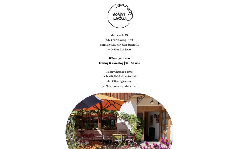
The starting point was the café’s existing website: a one-pager with the logo, address, contact details, opening hours and a photo centred one below the other. I analysed this page first.
Two design variants
In Figma, I designed two variants that interpret the café in different ways:
Variant A
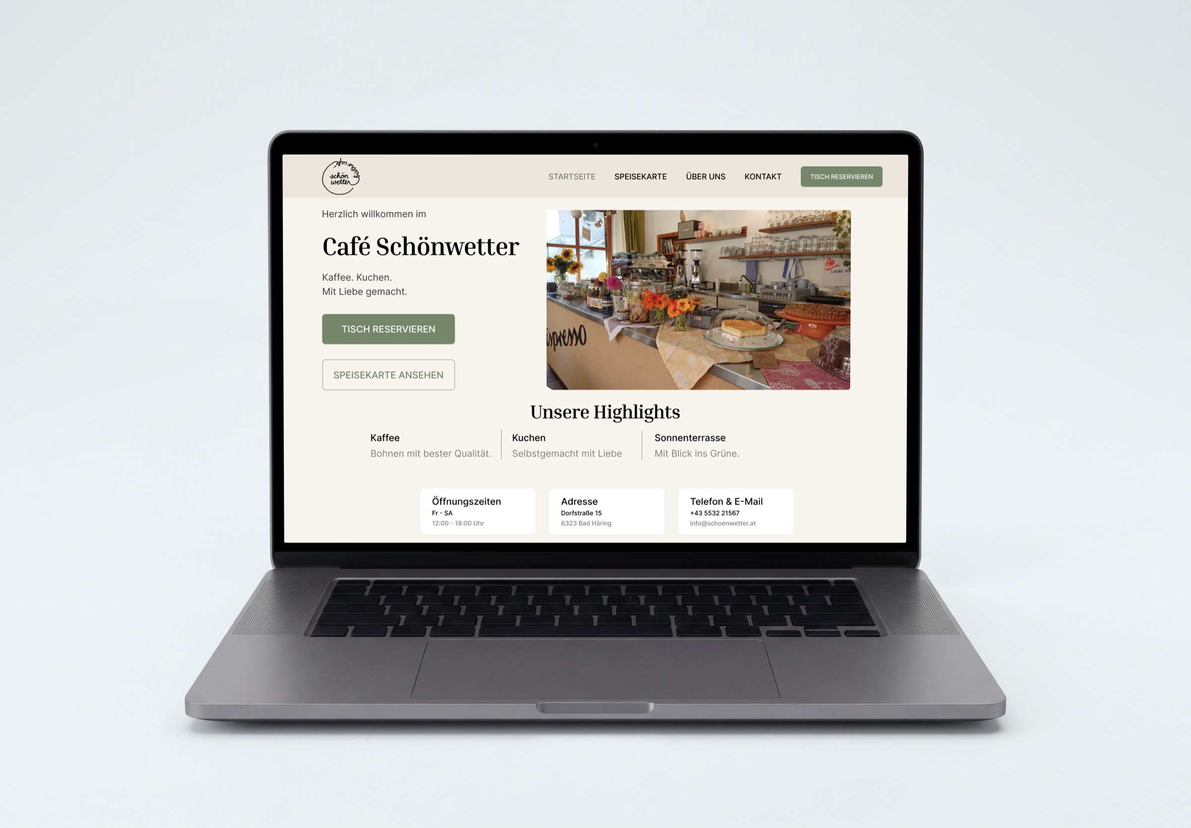
Classic and task-oriented: navigation with home, menu, about and contact, a “book a table” button, and opening hours, address and contact right on the homepage — in calm cream and sage green tones.
Variant B
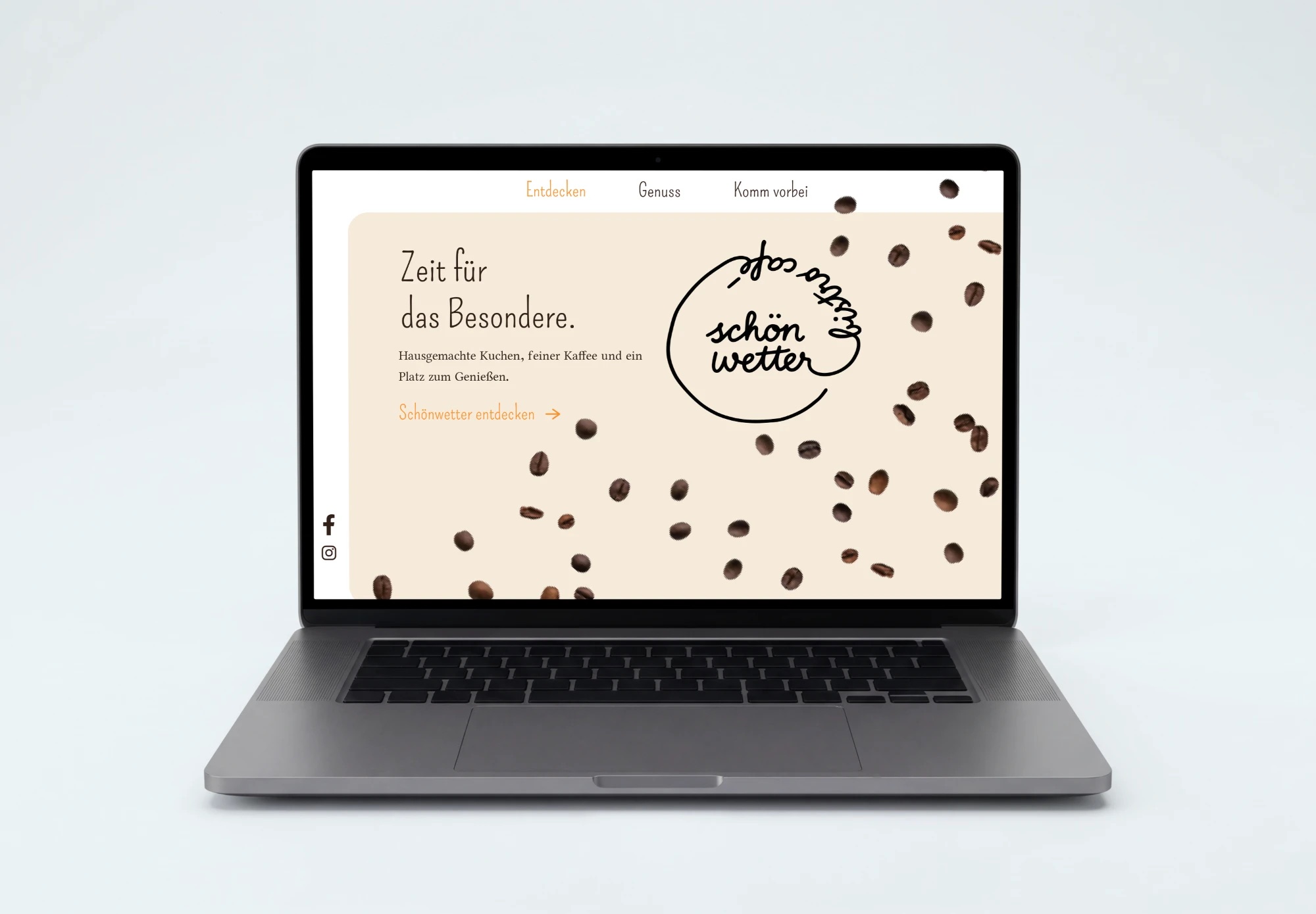
More atmospheric and playful: the hand-drawn logo large at the centre, coffee beans as a visual element, a handwritten-style typeface, the headline “Zeit für das Besondere.” (time for something special) and the navigation Entdecken, Genuss, Komm vorbei (discover, indulge, drop by).
Testing with five people
I evaluated both variants with five test participants.
- Orientation & clarityVariant A performed better.
- Overall preferenceFour out of five participants preferred variant B.
The best of both
Develop variant B further, with clearer navigation labels.
As a result, I recommend developing variant B further: it keeps the atmosphere most participants liked and, with clearer navigation labels, adopts variant A’s strength in orientation.
Let’s make something visible
I’m looking for an internship or a working-student position in communication design, branding or content production. I’d be glad to talk.